
Mobile-first indexing SEO is one of those terms that gets thrown around constantly, but I still run into business owners who don’t fully grasp what it means in practice. Here’s the plain-English version: Google’s mobile index means that Google crawls, evaluates, and ranks your website based on its mobile version — not your desktop version. That’s the baseline. It’s been rolling out since 2018, and by 2026, it’s fully universal. Every site. No exceptions.
If your mobile site is stripped-down, slow, or missing content that lives only on your desktop version, you’re getting ranked on an incomplete version of yourself. That’s a real problem, and it’s one I’ve seen hurt otherwise solid websites more times than I can count.
Why Google Made Mobile the Primary Index
This didn’t happen arbitrarily. Google follows user behavior, and the data is hard to argue with. According to StatCounter’s global platform tracking, mobile accounts for roughly 62.66% of global web traffic compared to about 35.69% for desktop. That gap has only widened over time.
For local and voice searches specifically, mobile dominance is even more pronounced. When someone is looking for a plumber, a restaurant, or an HVAC company near them, they’re almost certainly doing it from a phone. If you’re running a local business in Central Florida like many of my clients, your mobile experience isn’t a secondary concern — it’s your front door.
Google’s logic is simple: index the web the way most people actually experience it.
What the Google Mobile Index Actually Evaluates
This is where I see the most confusion. People hear “mobile-first” and think it just means having a responsive design. Responsiveness is the floor, not the ceiling. The Google mobile index evaluates several distinct things:
Content Parity Between Mobile and Desktop
If your desktop site has product descriptions, FAQs, or reviews that are hidden behind tabs or accordion menus on mobile — or worse, not rendered at all — Google may not fully index that content. This is especially damaging for e-commerce sites where product detail is a ranking signal.
I audited a regional retailer’s site a couple years back where their mobile version was literally suppressing a full column of text to save screen space. Their desktop rankings were fine for years. Once mobile-first indexing fully kicked in, their category pages dropped noticeably. The fix was straightforward once we identified it, but the damage took months to recover from.
Core Web Vitals on Mobile
Core Web Vitals are Google’s standardized performance metrics, and they’re measured differently on mobile than desktop. The current benchmarks you need to hit on mobile are:
- Largest Contentful Paint (LCP): 2.5 seconds or faster — measures how quickly the main content loads
- Interaction to Next Paint (INP): 200 milliseconds or under — measures responsiveness to user input (this replaced First Input Delay in 2024)
- Cumulative Layout Shift (CLS): 0.1 or lower — measures visual stability so buttons don’t jump around while the page loads
These aren’t soft guidelines. Google uses them as ranking signals, and the INP replacement of FID was a meaningful change that caught a lot of sites off guard. If you haven’t re-checked your Core Web Vitals since 2023, do it now. I cover these in more depth in my post on Core Web Vitals: The Technical SEO Metrics That Actually Matter.
Mobile Page Experience Signals
Mobile page experience is a composite signal that includes Core Web Vitals, HTTPS security, and the absence of intrusive interstitials (those pop-ups that cover content immediately on load). Google has been clear that pages which aggressively interrupt the mobile user experience with full-screen ads or pop-ups before the user can engage with content are penalized.
Speed alone matters enormously here. According to Google’s own research, 53% of mobile users abandon a site that takes longer than 3 seconds to load. That’s not a competitor’s study — it’s Google’s Think with Google data. Half your potential visitors are gone before they read a single word if your mobile load time is slow.
The Myth I Need to Bust: Responsive Design Isn’t Enough on Its Own
I’ve had this conversation dozens of times. A client says, “We’re fine — our site is responsive.” And technically, yes, their site scales to mobile screen sizes. But responsive design is a layout solution, not a performance solution.
A responsive site can still:
- Load a 4MB hero image that tanks your LCP score
- Run heavy JavaScript that blocks rendering on lower-end Android devices
- Have forms that are technically present but nearly impossible to fill out on a touchscreen
- Use font sizes that Google flags as too small to read without zooming
Responsiveness gets your site to mobile. Optimization makes it actually work on mobile. Those are two different things.
"Mobile is not the future, it is the now. Meet your customers in the environment of their choice, not where it’s convenient for you."
— Cyndie Shaffstall, Author and Digital Marketing Strategist
Mobile-First Indexing and Local SEO: The Connection Matters
If you run a local business, mobile-first indexing and local SEO are deeply intertwined. Google’s local map pack — those three business listings that appear above organic results — is heavily influenced by mobile experience signals. A slow mobile site doesn’t just hurt your organic rankings; it can suppress your map pack visibility too.
Think about the behavior pattern: someone searches “AC repair near me” on their phone at 2pm on a hot Florida afternoon. They’re not browsing. They’re deciding in seconds. If your site takes 5 seconds to load, they’ve already called your competitor.
I wrote about this dynamic in my Local SEO for Small Businesses: The Complete 2026 Guide — mobile speed is one of the most underestimated levers in local search performance.
How to Actually Audit Your Mobile-First Readiness
Here’s the practical process I walk clients through. None of this requires expensive tools.
Step 1: Check Google Search Console’s Mobile Usability Report
Log into Google Search Console and navigate to the Mobile Usability report under Experience. This tells you exactly which pages have issues and what type — clickable elements too close together, text too small, viewport not configured. Fix these first. They’re the easiest wins.
Step 2: Run PageSpeed Insights on Your Key Pages
Google PageSpeed Insights gives you real-world Core Web Vitals data from actual Chrome users, not just a lab simulation. Run it on your homepage, your top service or product pages, and your most trafficked blog posts. Pay attention to the mobile tab specifically.
The tool gives you specific recommendations — things like “eliminate render-blocking resources” or “serve images in next-gen formats.” These aren’t vague suggestions; they’re actionable items you can hand to a developer.
Step 3: Compare Mobile vs. Desktop Content Side by Side
Open your site on an actual phone (not just browser dev tools — real device behavior matters). Then open it on desktop. Walk through your key pages and ask: Is all the same content present? Are calls-to-action visible without excessive scrolling? Do forms work intuitively with a touchscreen keyboard?
If you’re running an e-commerce site, go through your entire checkout flow on mobile. This is where I find the most broken experiences — fields that don’t auto-format phone numbers, address forms that don’t trigger the right keyboard type, buttons that are too small to tap reliably.
Step 4: Check Your Structured Data on Mobile Pages
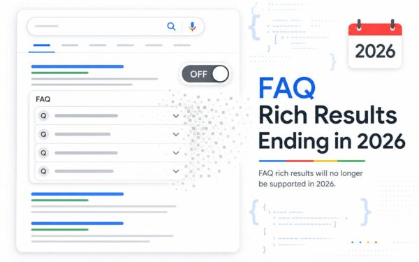
Structured data — schema markup — helps Google understand your content and can generate rich results in mobile search. If you have product schema, FAQ schema, or review schema on your desktop pages, make sure it’s present and valid on mobile too. Use Google’s Rich Results Test to verify. I covered schema in detail in my post on Schema Markup Explained: How Structured Data Gets You More Clicks.
The Performance Fixes That Actually Move the Needle
I’m not going to give you a generic list of 50 things to do. Here are the fixes that consistently make the biggest difference for mobile performance in my experience:
- Image compression and format conversion: Switch to WebP or AVIF formats. Compress images before upload. This alone can cut page weight by 30-50% on image-heavy sites.
- Implement lazy loading: Images below the fold shouldn’t load until the user scrolls to them. This is a one-line HTML attribute (
loading="lazy") that has a real impact on LCP. - Minimize render-blocking JavaScript: Scripts that load in the
<head>and block page rendering are a common culprit for slow mobile load times. Defer non-critical scripts. - Use a CDN: A content delivery network serves your assets from servers geographically closer to your users. For a Florida business with national traffic, this matters.
- Audit third-party scripts: Every chat widget, analytics tag, and ad pixel adds load time. Audit what’s actually running on your pages and remove anything you’re not actively using.
"Speed is a feature. First and foremost, it’s about respecting your users’ time."
— Ilya Grigorik, Web Performance Engineer, Google
What About AI Search and Mobile-First Indexing?
This is worth addressing because it’s increasingly relevant. Google’s AI Overviews — those AI-generated summary boxes at the top of search results — pull from indexed content. If your mobile content is incomplete or poorly structured, you’re less likely to be cited in those overviews.
The relationship works like this: mobile-first indexing determines what Google indexes, what Google indexes determines what’s available for AI Overviews to cite, and AI Overviews are increasingly what users see before they ever click a result. The chain matters.
I touched on how Google’s ranking volatility connects to these broader indexing changes in my post on Google Search Ranking Volatility Is Still Heating Up Into March 2026 — worth a read if you’ve noticed unexplained traffic fluctuations.
The One Thing Most Competitors Miss: Mobile Conversion Parity
Everyone talks about mobile rankings. Almost nobody talks about what happens after the click. You can have a perfectly optimized mobile page that ranks well and still lose the conversion because your contact form is broken on iOS, your phone number isn’t click-to-call, or your booking widget doesn’t work on Safari.
Mobile page experience isn’t just a ranking concept — it’s a revenue concept. A site that ranks #3 and converts at 4% on mobile beats a site that ranks #1 and converts at 1%. If you’re investing in mobile SEO without also investing in mobile conversion rate optimization, you’re leaving money on the table. My post on Landing Page Optimization: Small Changes That Actually Move the Needle covers some of this from the CRO angle.
Resources
- Google Developers: Mobile-First Indexing Best Practices – Official documentation from Google on how mobile-first indexing works
- Google PageSpeed Insights – Free tool to measure Core Web Vitals and mobile performance on real-world data
- Google Search Console – Monitor mobile usability issues and Core Web Vitals for your specific site
- Think with Google: Mobile Page Speed Industry Benchmarks – Google’s research on mobile load time and user abandonment behavior
- StatCounter Global Platform Market Share – Real-time data on mobile vs. desktop web traffic globally
Conclusion
Mobile-first indexing SEO isn’t a trend you can wait out or a box you check once. It’s the permanent reality of how Google evaluates your website. Your mobile experience is your SEO in 2026. The good news is that most of the fixes are concrete, testable, and within reach for any site owner who’s willing to do the work.
Start with Google Search Console to find your current mobile usability issues. Run PageSpeed Insights on your most important pages. Compare your mobile and desktop content side by side. Fix the biggest performance bottlenecks first. Then measure again.
If you’re not sure where your site stands or you want a second set of eyes on your mobile performance, reach out and let’s talk. I work with businesses across Central Florida and beyond, and a mobile audit is usually where I find the fastest wins.
Frequently Asked Questions
Does mobile-first indexing mean my desktop site doesn’t matter anymore?
Your desktop site still matters for user experience — plenty of people still browse on desktop. But for ranking purposes, Google uses your mobile version as the primary signal. If your desktop and mobile versions have the same content and performance, you’re fine. The problem arises when they’re meaningfully different.
What’s the fastest way to check if my site has mobile-first indexing issues?
Go to Google Search Console, navigate to Experience > Mobile Usability, and look for flagged pages. Then run your homepage through Google PageSpeed Insights and look at the mobile score specifically. Those two tools together will surface 80% of the most common issues.
My site is responsive — why are my mobile rankings still dropping?
Responsive design handles layout, not performance. A responsive site can still have slow load times, render-blocking scripts, uncompressed images, or content hidden in ways Google doesn’t fully index. Check your Core Web Vitals scores on mobile — LCP, INP, and CLS — and look for content parity issues between your mobile and desktop versions.
Does mobile-first indexing affect local SEO rankings differently than organic rankings?
Yes, and the impact can be significant for local businesses. Mobile speed and page experience signals influence both your organic rankings and your local map pack visibility. Since the vast majority of local searches happen on mobile, a slow or broken mobile experience can suppress your map pack position even if your Google Business Profile is well-optimized.
Technical SEO cluster: Mobile-first indexing matters most when your mobile templates are fast, readable, and easy for Google to render. Use this alongside my Core Web Vitals guide and technical SEO audit checklist.